MINIATURE TREASURES WITH VERONICA DITTING
I spoke to creative director and graphic designer Veronica Ditting about Small Print, a window exhibition featuring her miniature book collection at independent bookshop, Tenderbooks.
I spent seven years working closely with Veronica. One of the things that always inspired me was the great deal of thought she put into even the tiniest details of her work. It’s no surprise, then, that her collection of 115 miniature treasures, encouraging us to pay closer attention to unexpected details, have become the focus of a new exhibition.
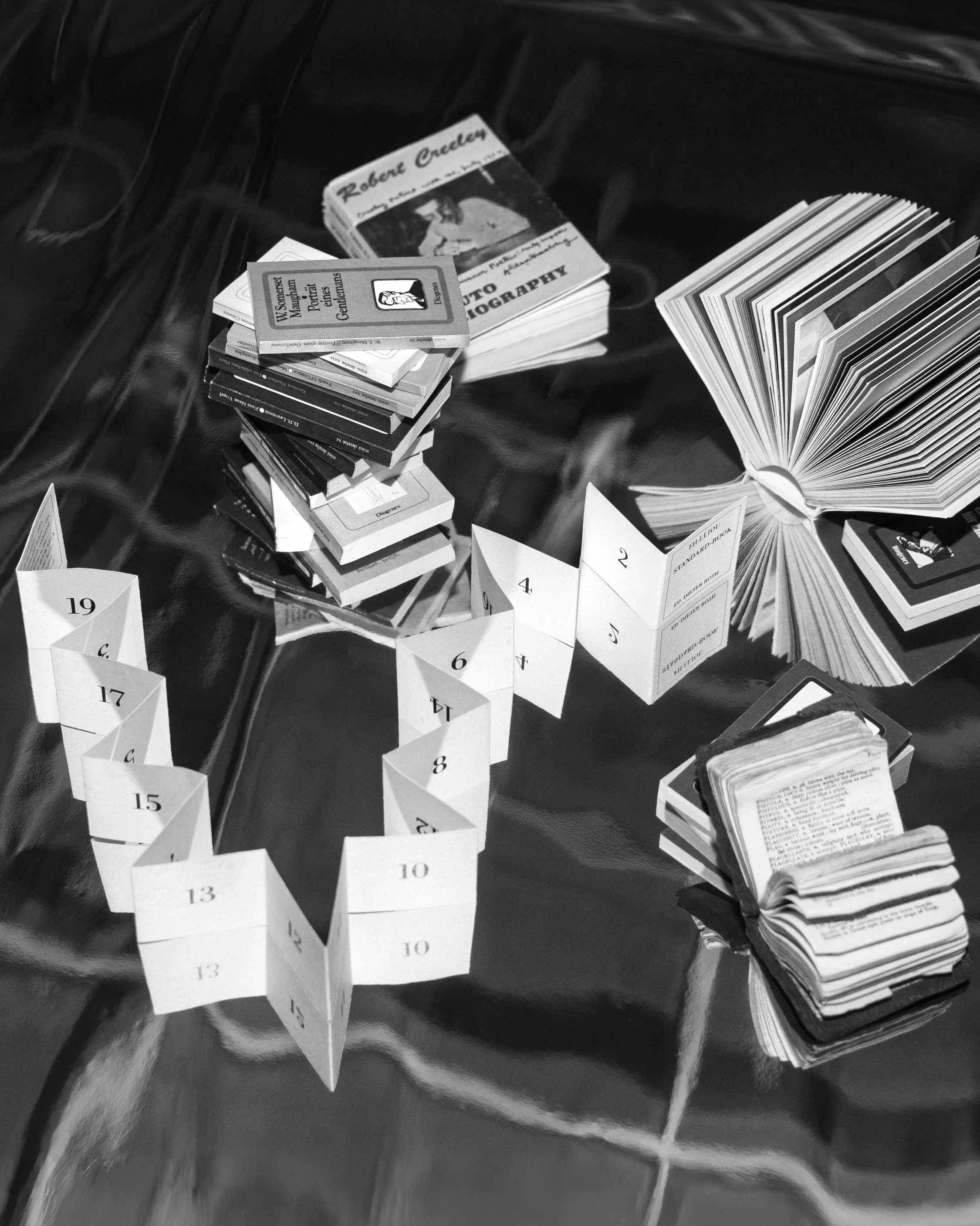
A part of Veronica Ditting’s miniature book collection
What is it about miniature things?
It’s a good question. For me, it’s the idea of tactility and how something relates to the size of your hand. With a miniature object, you can hold the whole thing in your palm which allows for a certain gesture or intimacy with it. It also makes me think about netsuke, those intricate carvings made from wood, ivory, and other materials in 17th-century Japan. They were usually attached to their owners’ belts and in a way they also speak to touch and how it relates to one’s sensibilities and hands.
How did your collection start and how has your process of collecting miniatures developed over time?
When I was a child, my parents always had a lot of pocket books. Mostly miniature dictionaries that we would take on holiday. I was quite drawn to them as a child and managed to steal a couple off their bookshelves! So that was the beginning of my fascination with miniature books. Over the years I’ve added things, but I must say I’m a lazy collector. If I come across something, I might get it, but I’ve not been seriously collecting.
You’re not seeking them out but can you give me some examples of places you’ve found them?
Whenever I’m travelling, part of my itinerary is visiting vintage bookshops—in Rome, Brussels, or more recently Amsterdam, where I used to live. I think the idea of hunting for something is part of the appeal, as well as serendipity. There are things I really have my eye on, but they’re difficult to come by—a facsimile of Marcel Broodthaers’ Atlas, for example, or miniature publications by Ed Ruscha and Dieter Roth. I haven’t been lucky enough to find those for a reasonable price; they usually go at auction for a lot of money. The experience of finding something in a bookshop is definitely more fulfilling than buying it off eBay. But I do that as well if I’m after something very specific. It’s actually quite difficult to look for them online unless you’ve seen them before, because photos can cheat your eye about the size or the print quality. I came across The Lord’s Prayer book years ago in an antique shop in Buenos Aires. It was sold for a substantial sum, and I wasn’t willing to spend that, but by chance I later found it on eBay.
How many books form your collection?
Around 115 miniature books plus my own works will be on display during Small Print at Tenderbooks. We’ll see what fits in the vitrine during the install. It sounds like a lot, but given the scale—some are really tiny—it won’t take up much space. There will be room to display some of the leporellos fully open, for example.

Veronica Ditting’s miniature book collection on her studio shelves

A part of Veronica Ditting’s miniature book collection
A bookshop window feels like the perfect place to exhibit this! But how do you make sure these miniature books get the attention they deserve? I imagine it's all about the arrangement. Can you talk me through the process?
I’ve very loosely thought about it because I want to arrange spontaneously but we made a model of part of the vitrine and arranged the books in the studio. Last year, for my exhibition at ddd in Kyoto, we built stands for all the works so you could look at them from different vantage points, which helped clarify their object value. Some of those stands will be in the Tenderbooks vitrine. My own miniature publications will be shown on the stands, and we’ll also have a stand for The Lord’s Prayer book with a magnifying glass. For each book, I’ll see what’s the nicest part to display – a hefty spine, an open spread or just showing it as chunky book block. Tenderbooks asked to mix in some of the publications which will be on sale.
The shelves in the window are built by London-based architecture and furniture design studio Jones Neville, and for the exhibition we’re lining the back of the shelves with a red/burnt-orange linen that I used in the Kyoto show, so it will frame everything differently. Jones Neville is also building a mini shelf, so some publications can be handled more easily than those in the vitrine.
Having worked with you, I knew there would be something already mocked up to scale to test things out. Love that!
It’s very low-key, just a strip of paper, but yes. Building the whole shelving system would have been going a bit too far!
There’s a wide variety of categories in the collection, from travel and photography books to almanacs and novels. The Filliou Standard-Book by Dieter Roth looks intriguing.
Dieter Roth experimented a lot with the form of the book which is why I admire his work. This book, which he made with Robert Filliou, a Fluxus artist, is very playful in how it links form and idea. It’s a bit of a one-liner. I bought it from Boekie Woekie, a lovely bookshop in Amsterdam. One of the shop owners was friends with Dieter Roth, and when I asked for more information, he demonstrated it by folding it around another book and saying, “There you go—this book is a thirteen” It’s a playful tool that makes you look at things differently. I like how it doesn’t take itself too seriously.
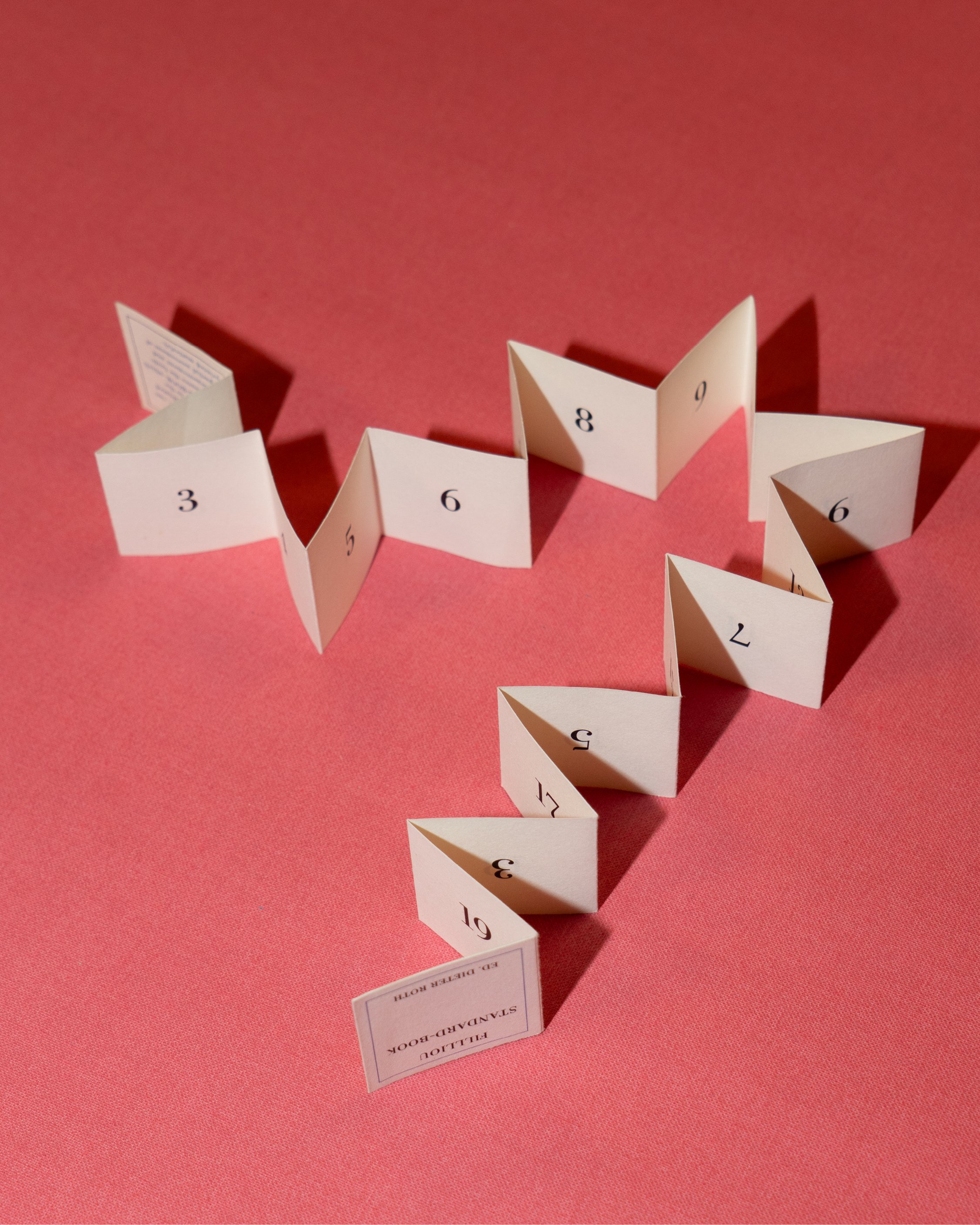
Filliou Standard-Book by Dieter Roth and Robert Filliou (1982)
40 × 40mm
If you had to choose, which would be your top three?
It’s hard to choose favourites. I really like the diversity: there’s novels, dictionaries, engineering tool books, prayer books. But overall, I’m most drawn to the 1960s–80s conceptual-art books. So the Dieter Roth and Robert Filliou piece fits right in. Another I adore is by the American artist Erica Van Horn. She made a small booklet, part of her Italian Lesson series, that’s just fingerprints at real scale, with the Italian text for each finger printed beneath. It’s a perfect connection of scale, form and content. I also love the Suntory whisky promotional publication from 1968. The photography is excellent and the finishing is beautiful. It’s a hardcover, exquisitely printed, and a bit obscure that nudes would be used as promotional material for a whisky company. The finish is quite special.

Italian Lesson No. 13: Identificazione by Erica Van Horn (1994)
8 × 5.5cm
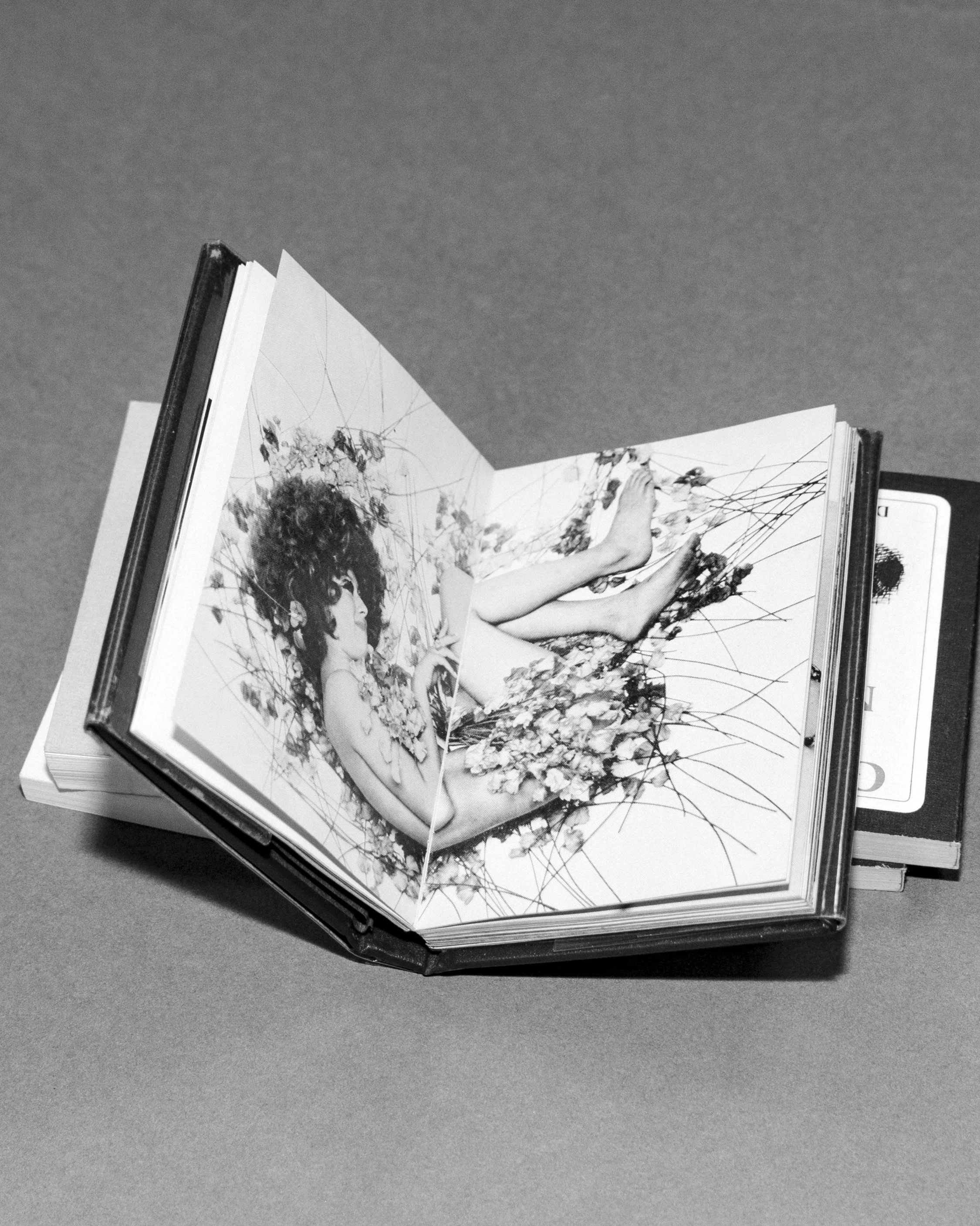
1. Nude Cocktail by Tatsuhiko Shibusawa for Suntory Whisky (c. 1960s–1970s)
69 × 95mm

1. Nude Cocktail by Tatsuhiko Shibusawa for Suntory Whisky (c. 1960s–1970s)
69 × 95mm
I’m baffled by how the smallest book in your collection was produced. Do you know much about its fabrication?
After the second world war, Gutenberg Museum in Mainz initiated this miniature printing of the Lord’s Prayer in seven languages to raise money for the museum. It’s 5 x 5 mm large. The technicality of it: the printing, the binding, the detail on the cover is remarkable. Because of the scale, you couldn’t print it in offset; they engraved a whole page onto a single metal plate, so it’s letterpress at the most minuscule scale imaginable. I’m displaying the book with my magnifying glass, which I’ve used for over a decade for press passing as you can’t read it with the naked eye.

The Lord’s Prayer published by the Gutenberg Museum (1952)
Legible with a magnifying glass at 5 × 5mm
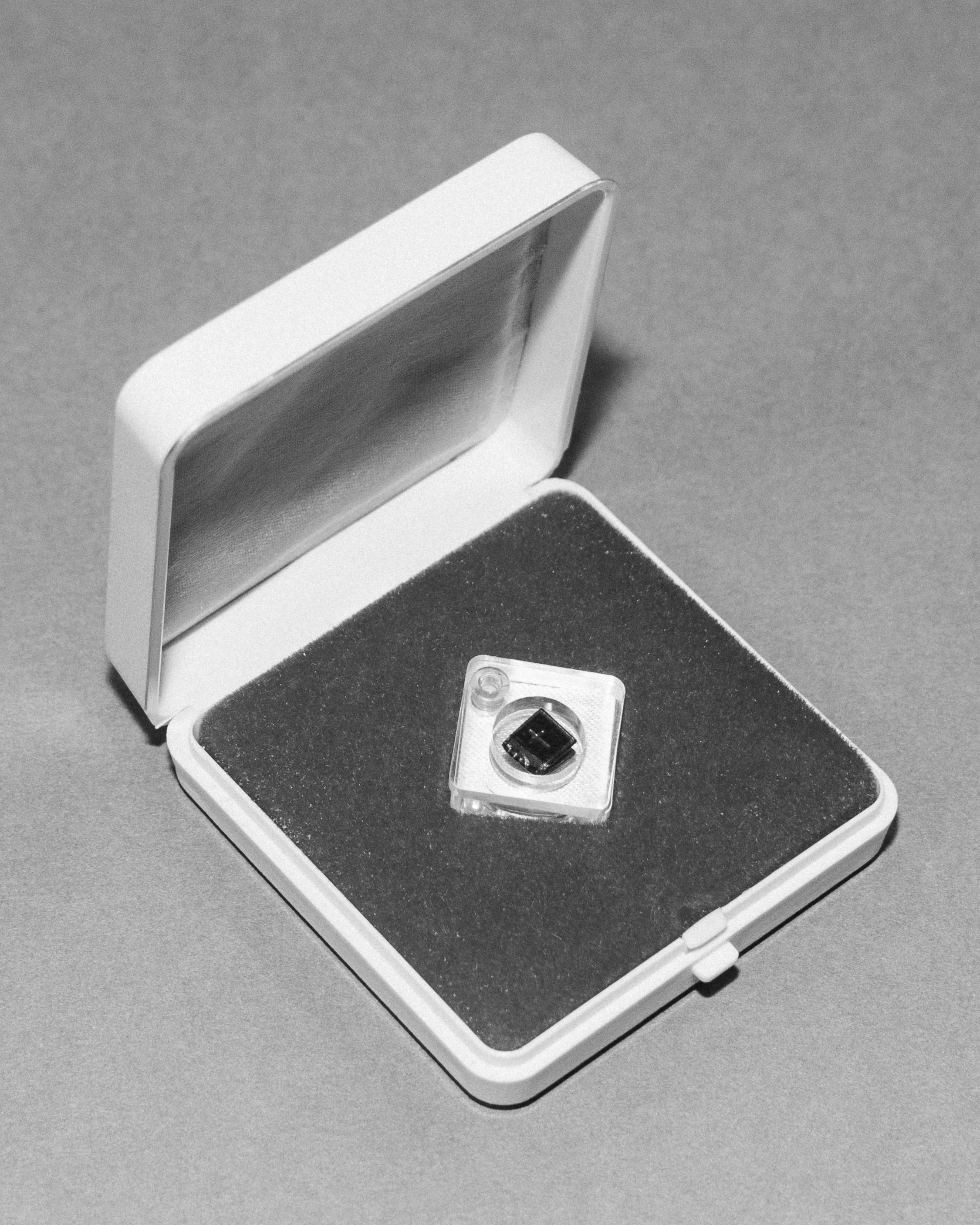
The Lord’s Prayer published by the Gutenberg Museum (1952)
Legible with a magnifying glass at 5 × 5mm
Some of your own work is part of the exhibition. In what ways does your collection inform your practice?Studying form, scale, ratio, and how they relate to content, and importantly, to functionality is key to my work. For example, this year I worked with Hermès Beauty on the launch of their Rouge Brillant Silky lipstick collection. We made an 8-metre-long publication showing tight crops of all the shades on different lips. For the event invitation, I scaled the lips down to real size so that if you held the image up to your face, it would be roughly life-sized. It was a miniature version of the large leporello from the launch.
The Gentlewoman miniature edition, in celebration of the 20th issue, was directly influenced by my miniature collection. For an anniversary, you might be tempted to make a monograph, which often looks back. Instead I wanted to make something that activated the material differently. So I suggested making a miniature magazine, making long-form pieces work on such a small scale took a lot of effort.
Then the flip book we created as invitations for the Hermès Silk events back in 2018 referenced the silk scarf’s iconic square format (90 × 90). I suggested showing two hands forming a square against each city’s skyline, so when you flick through the pages, the square appears framing the city and signalling the brand codes.
Another piece we’re exhibiting is the Hermès Beauty Rouge invitation for the brand’s very first beauty launch in 2020. No one knew what the chapter would look or feel like. We made a press publication based on the ratio of the lipstick packaging and then cut it down to the height of three stacked lipstick packages for the launch event invitation. All the colours of the shades were included, without explanation. A sort of colour exploration. It became a peculiar-sized booklet showing the colours of the maison.
Which of those did you most enjoy working on?
I think the Hermès Beauty Rouge invitation felt very new and was a particular step in my career development, so I’m still fond of it. You never know how people will react when they receive something, and it was lovely to see how the printed piece went a bit viral. It was quite nice to see people enjoying the format and using it in their own communication in the lead-up to the event.
I’m also very fond of The Gentlewoman mini magazine as an idea, but it was far more work than I anticipated! It’s 540 pages, and legibility is extremely important to me. Everything had to be re-typeset because it’s impossible to simply scale things down and have them work. It feels like a fully rounded project and I like how it was a direct link to my childhood possessions.

The Gentlewoman miniature magazine (2019/2020)
60 x 81mm
The Hermès Beauty Rouge invitation is such a beautiful object. You’d want to keep it on your shelf
Funny you say that because that’s actually how I met Dal Chodha who advises Tenderbooks and is their sounding board. He’d received an invitation or booklet I created and was intrigued by it so asked the PR to always send them to him. So it was through the curiosity sparked by printed matter.
How did the idea for the exhibition come about?
Dal knew about some of my miniature publications as I have them scattered around the studio. He’d also interviewed me for Wallpaper, so he knew I collect a lot of peculiar printed matter. He asked me in spring if I wanted to do the show on my miniature books with Tenderbooks, but the studio schedule made it impossible. So we settled on the idea of a holiday window.
Talk to me about what else people will see at the launch
We’ve produced some miniature canvas bags with Small Print and Tenderbooks details on the back in black and red as well as an embroidered cap. I thought it would be fun to play with it a bit and explore the idea of mini-merch. The exhibition isn’t taking itself too seriously. It’s just, no pun intended, a small idea!
Small Print
16 December 2025 – 6 January 2026
Tenderbooks
6 Cecil Court
London WC2N 4HE